
Filter Design
Design systems
Information architecture
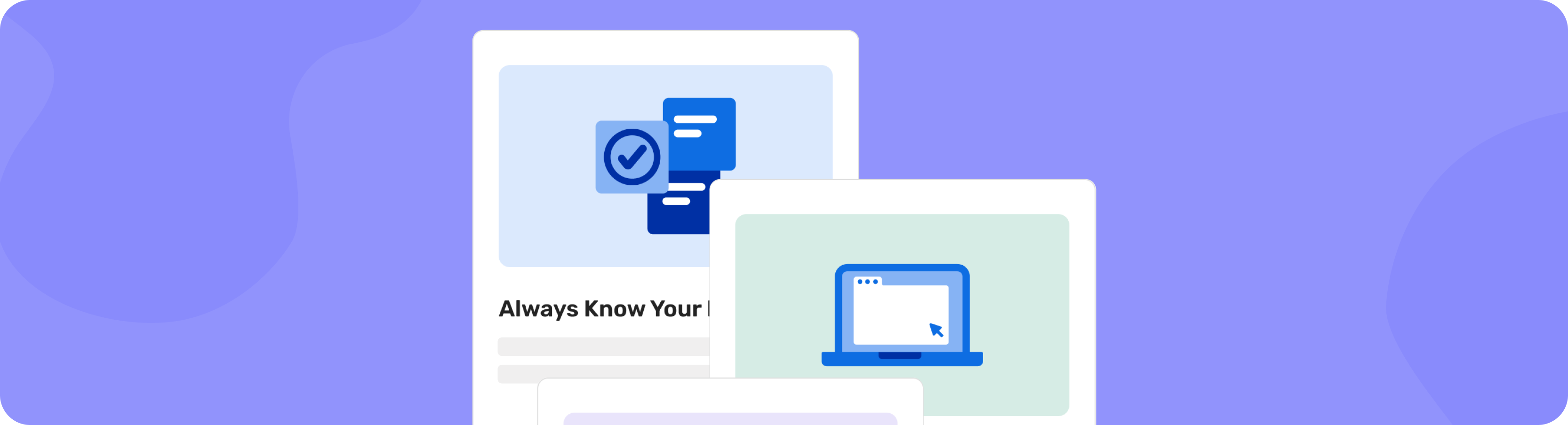
Helping venues find the right event opportunities faster
Mending bonds between hotels and planners while scaling an intelligence powerhouse for better product market fit.
Role
Design lead, Researcher
Team
Product designer, Content designer, Engineers, Product management
Timeline
Mar - Apr 2022 (3 months)
Tasks
Information architecture, Interviews, Prototyping, Synthesis
Tools
Figma, Pendo
Hotels were struggling to find planners to connect with due to a perplexing dual filter system and clunky results. I created a scalable revamp with clearer content by conducting knowledge transfers, auditing other Cvent solutions, and testing internally. This redesign increased visible results by 400% and contributed to $5M in revenue.
+5M
Target venue adoption
47%
↑ Unique users YOY post launch
55%
↑ YOY increase in user engagement
Context
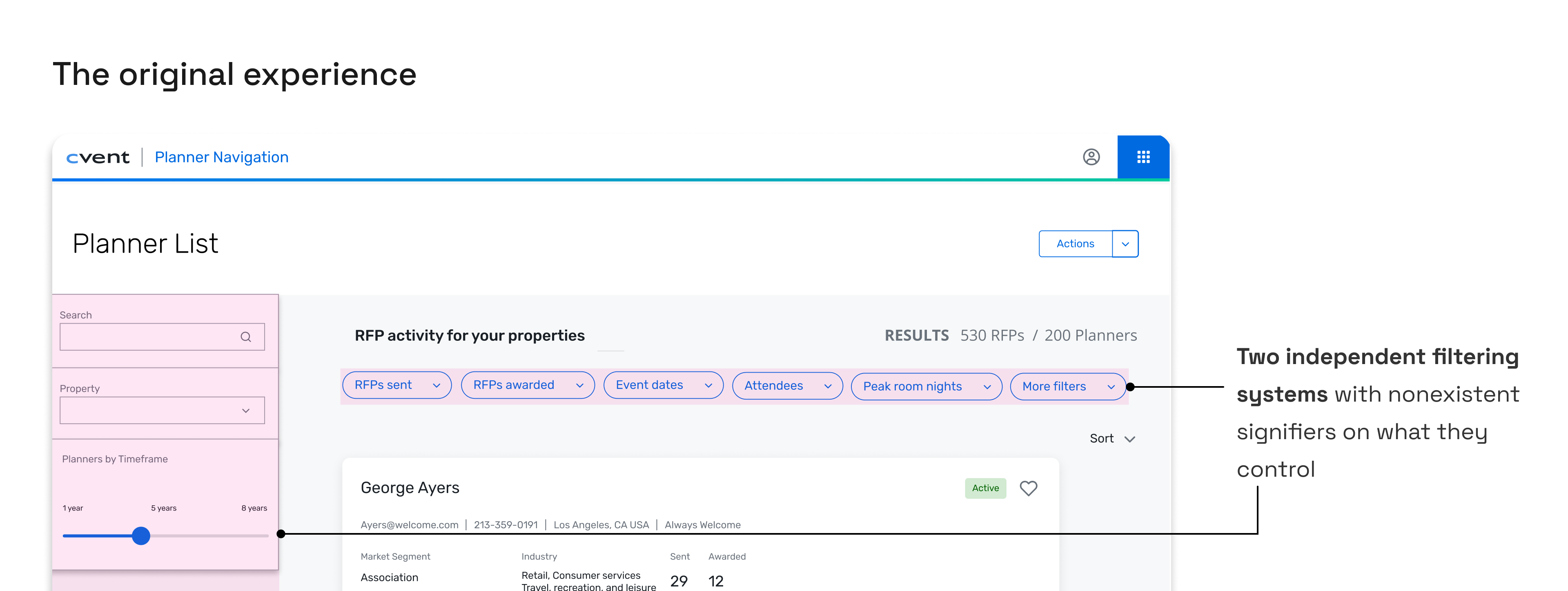
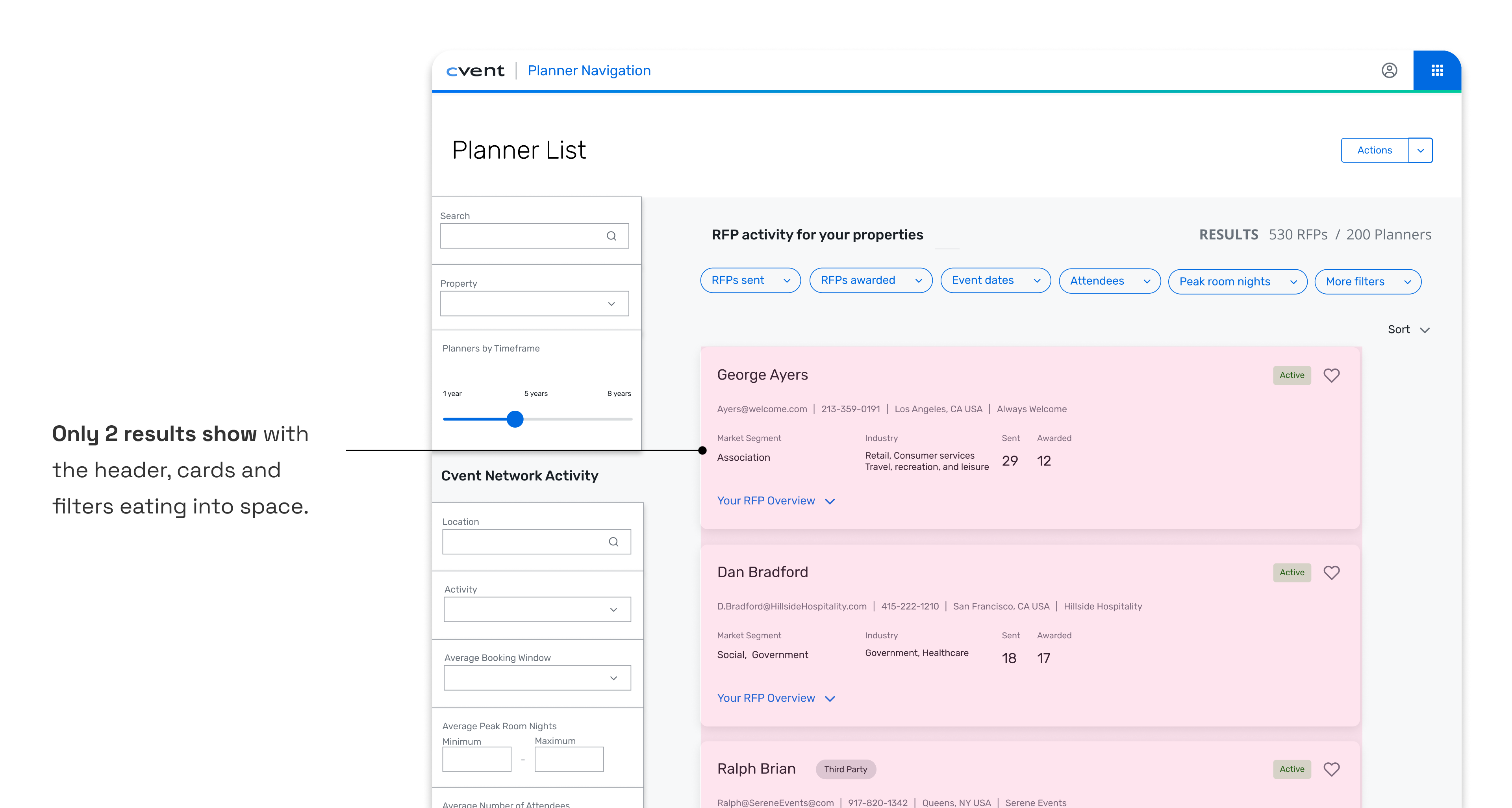
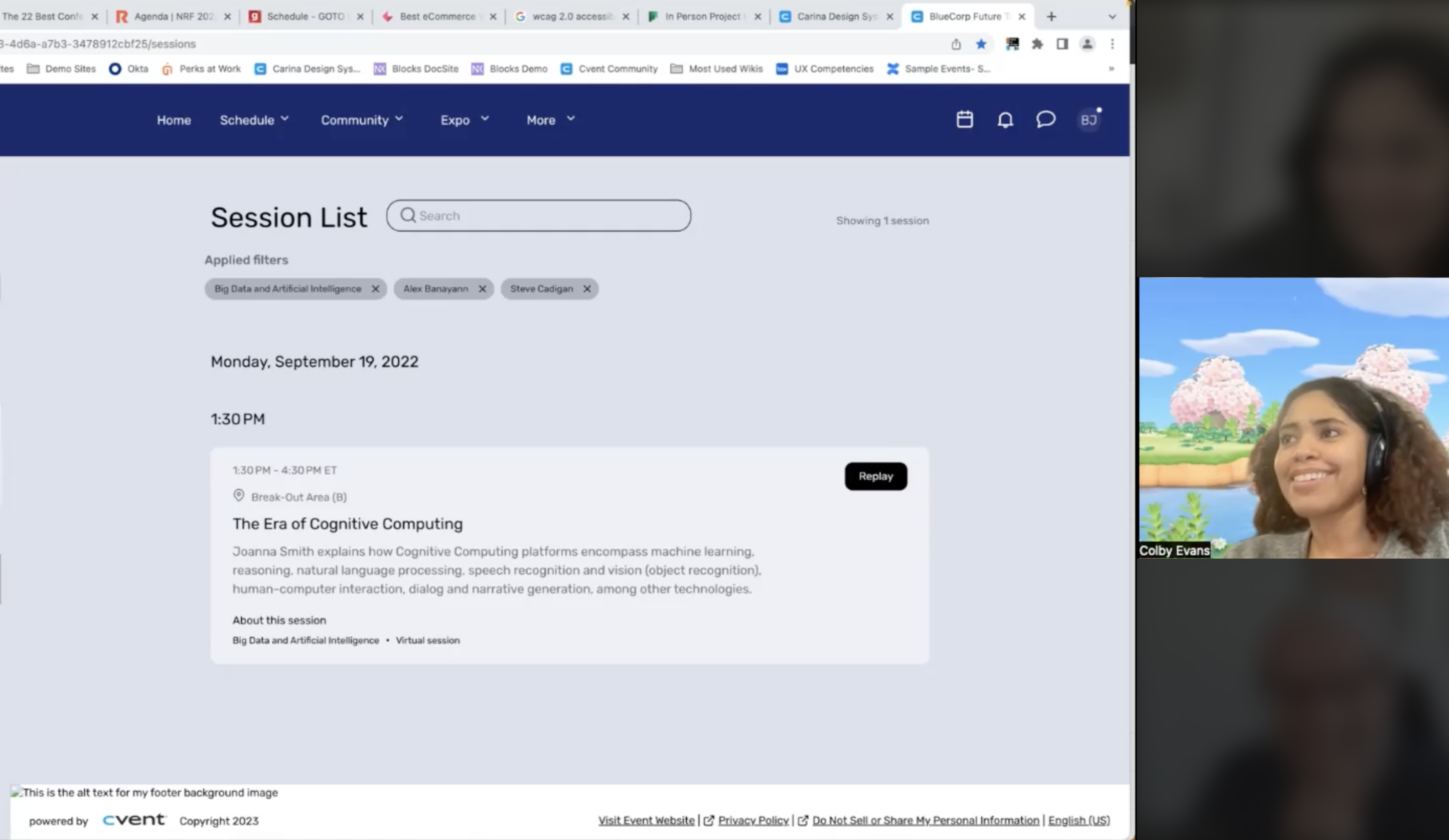
Planner Navigator (PN) is a tool that hoteliers (salespeople at hotels) use to research and connect with planners. It has the best planner and event data in the industry but hoteliers weren’t sticking around. Tedious filtering and navigation made PN feel like a luxury address book no one had time to decode.
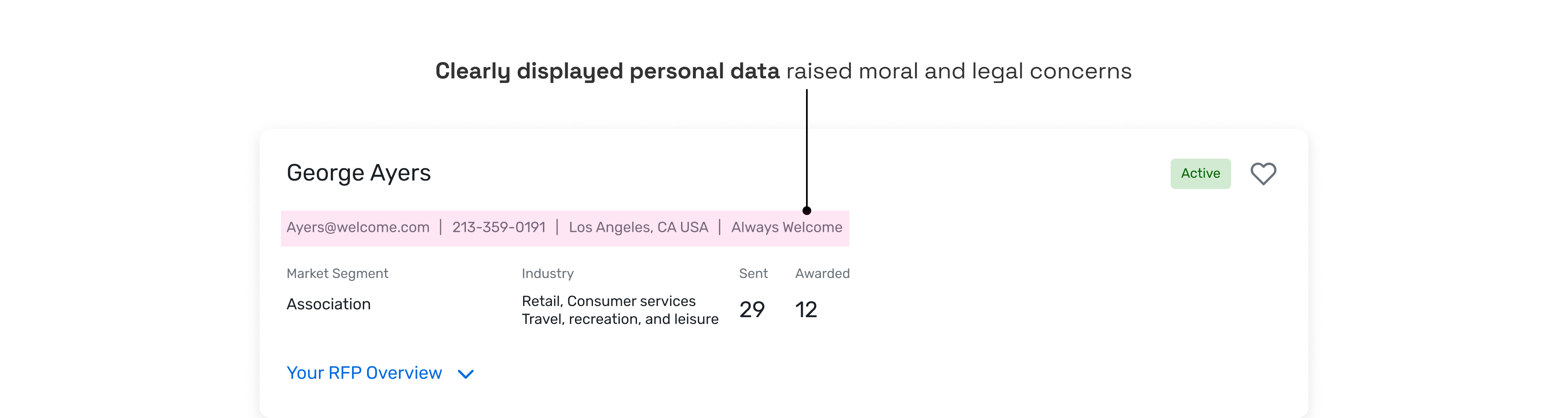
The problem
How might we create a simplified yet scalable filtering system that users can know what they’re controlling and see more results per page?
*Without restructuring the current workflow
Process
Building the right foundation before sketching was imperative. Only one SME in the organization truly understood how the filtering logic worked (we couldn’t blame users for being confused 😅), so I did a series of knowledge transfers.
01
Audit and knowledge transfers
Reverse engineer how filters actually work
Collaborator: UX
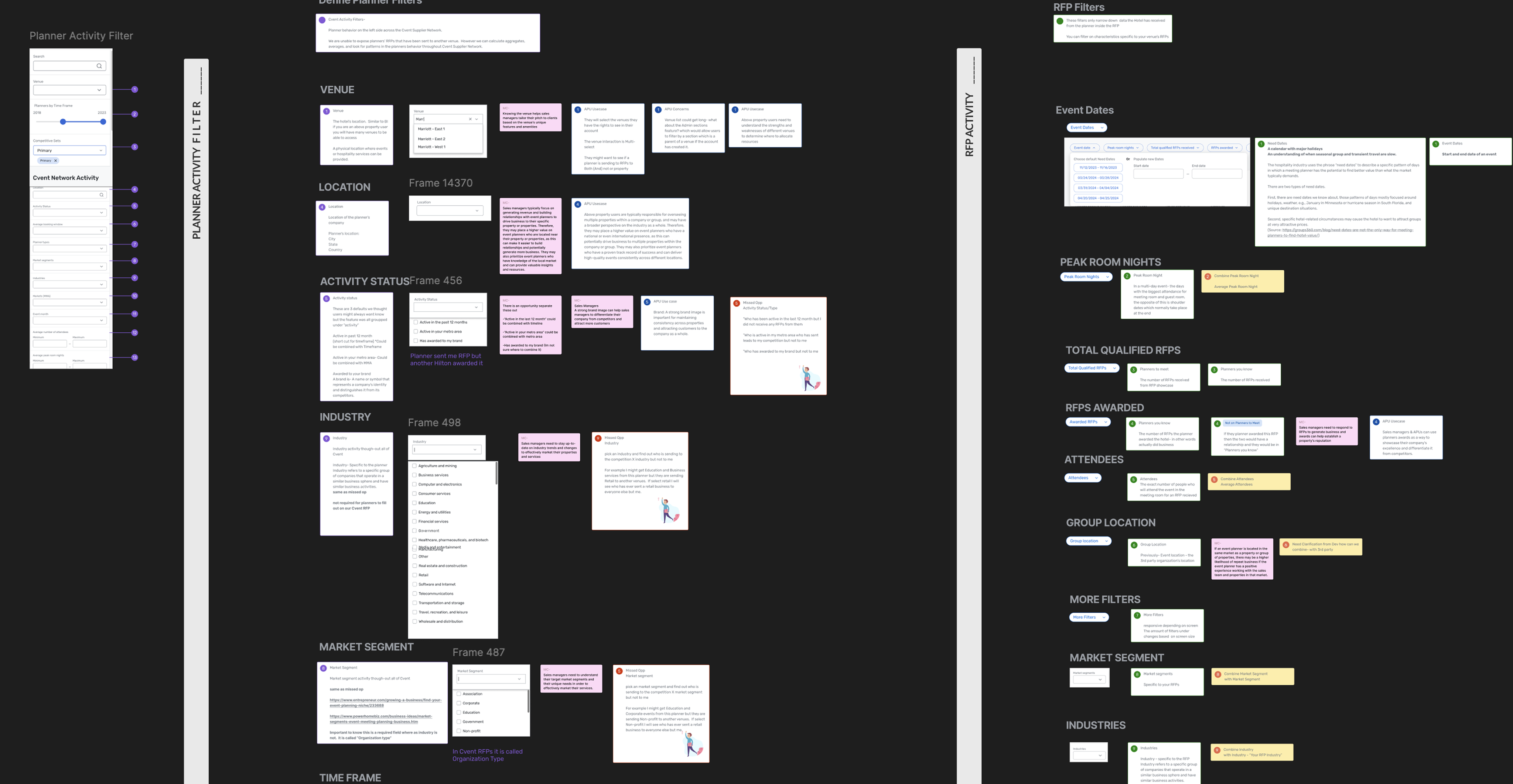
02
Review analytics
What’s used most, and does hierarchy support placement
Collaborators: Devs, PDs, CDs, UX management
03
Polish
What did other teams try, what failed, and why?
Collaborators: UX
Exploring Interaction Models
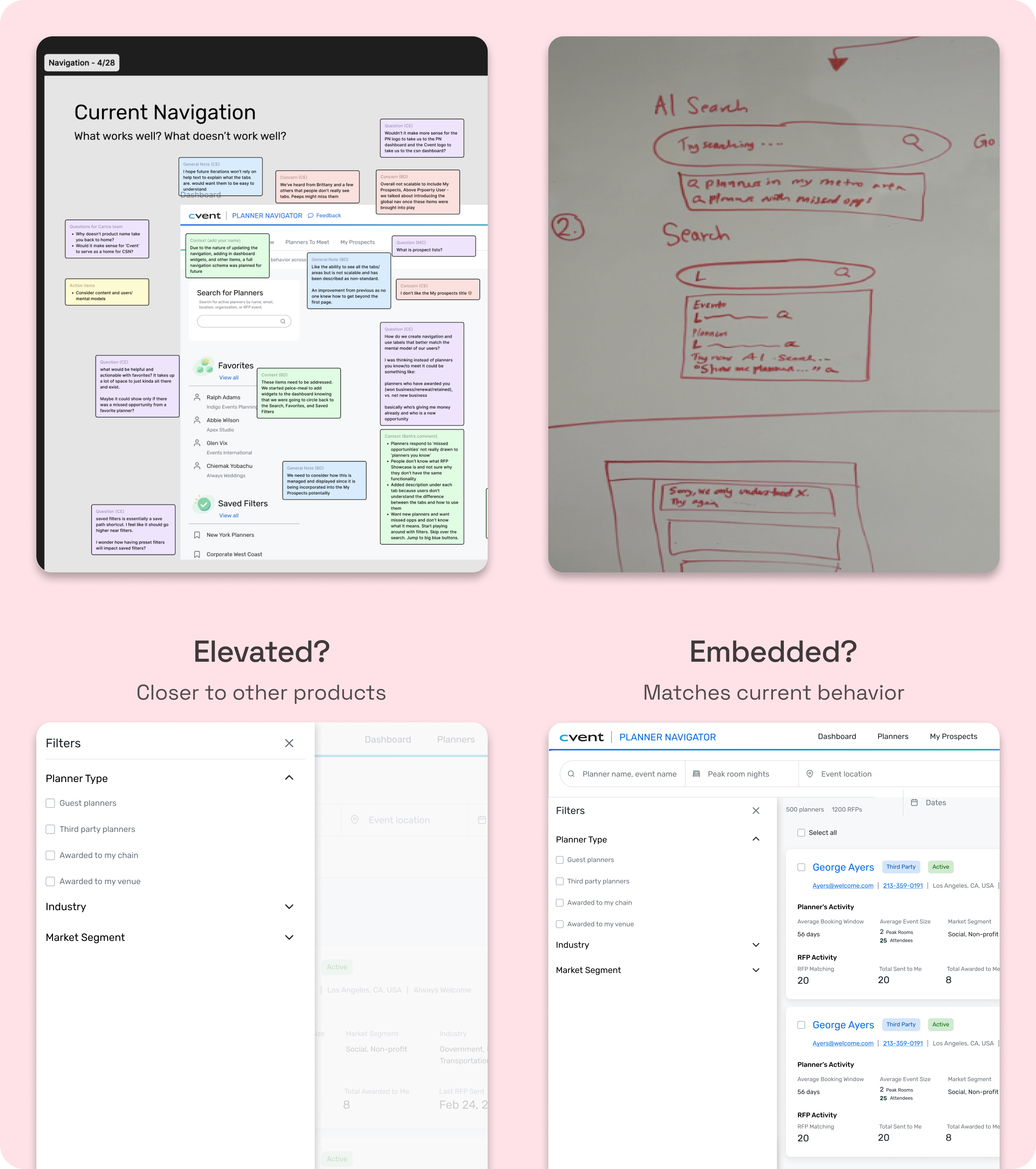
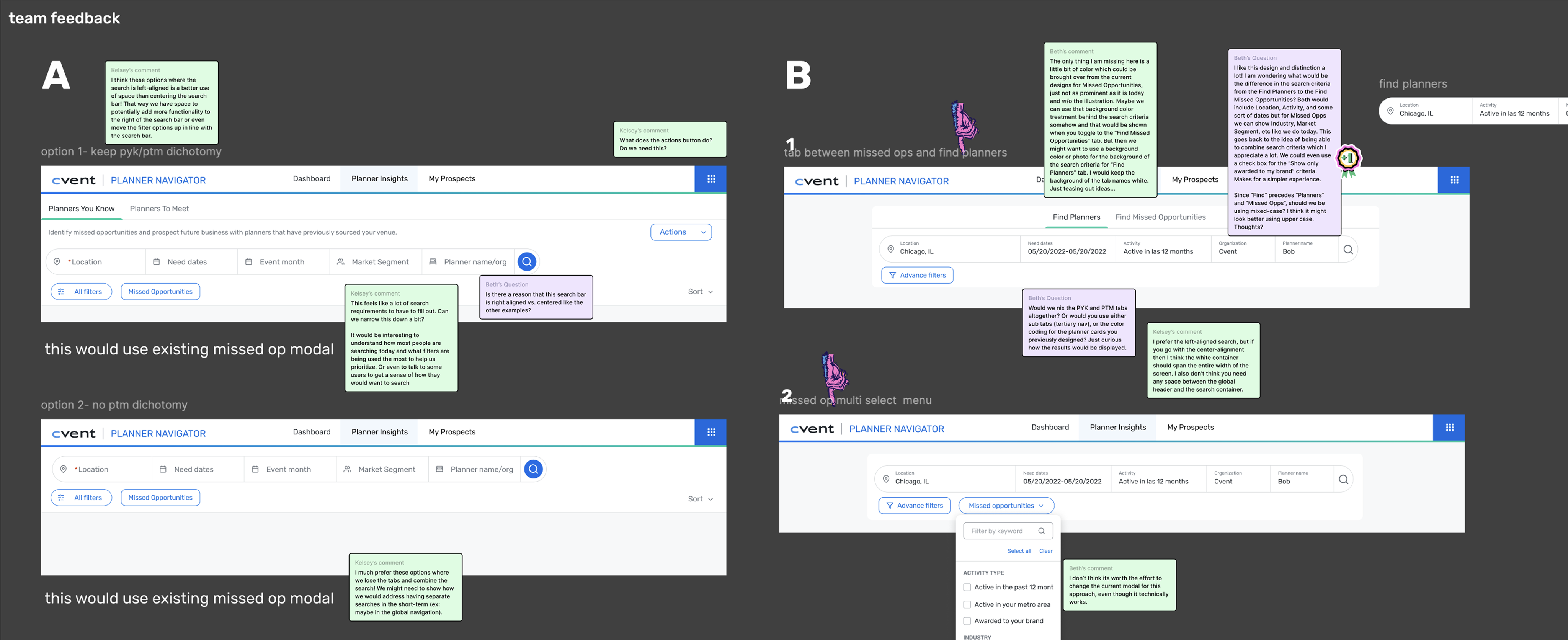
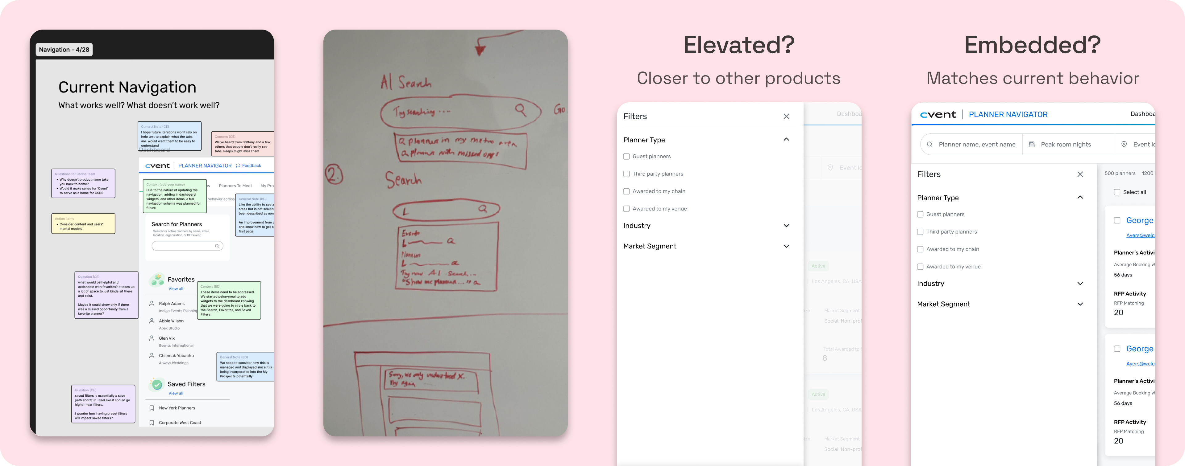
At this point in the project I envisioned search, filtering and navigation as inter-related elements that needed to be revamped at the same time (something I revisit in key decisions 😮💨). I ran workshops on search and nav to pull concepts into different panel explorations.
Key Decisions
Narrowing the scope
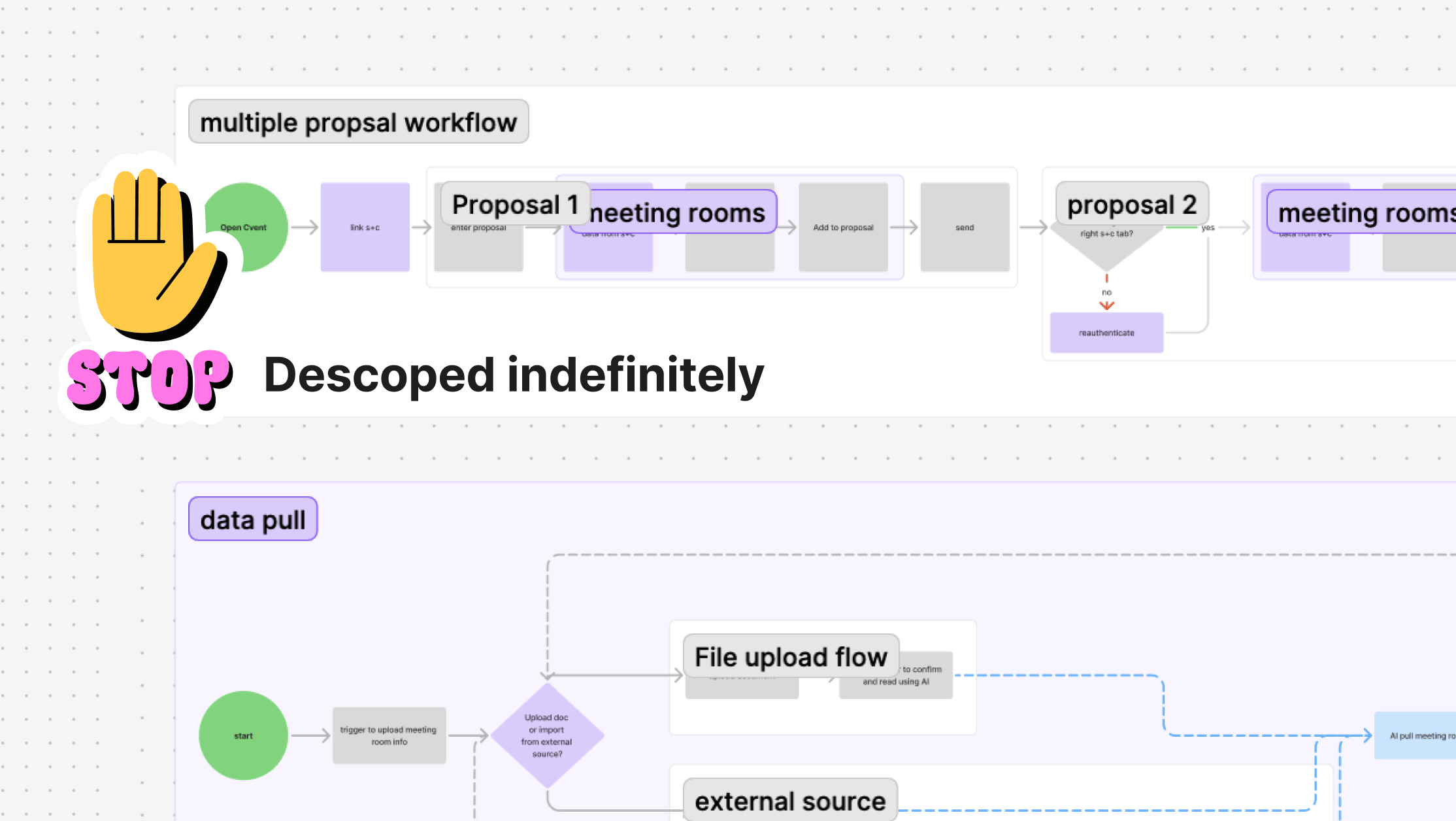
Designing for multiple proposals simultaneously would have had a higher payoff, but required exploration well outside our timeline. With three months on the clock, I made the call to nail the basics and focus on a single proposal.
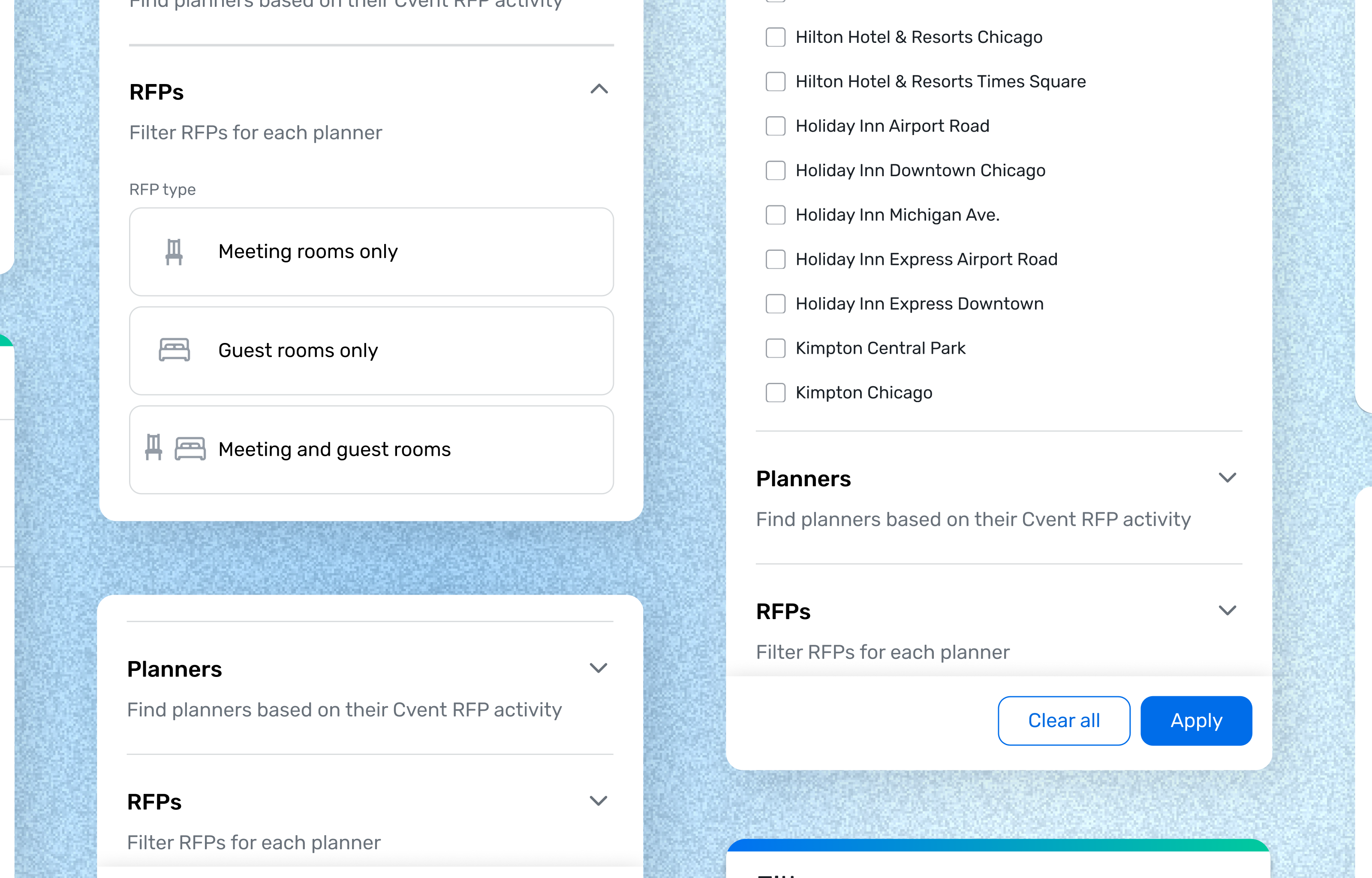
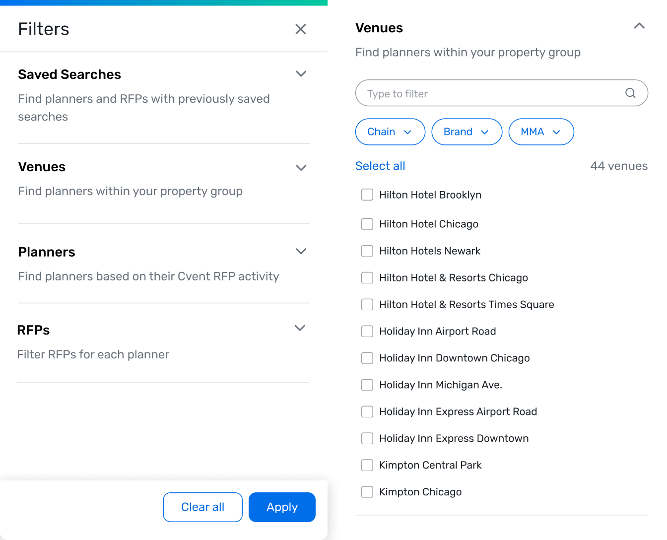
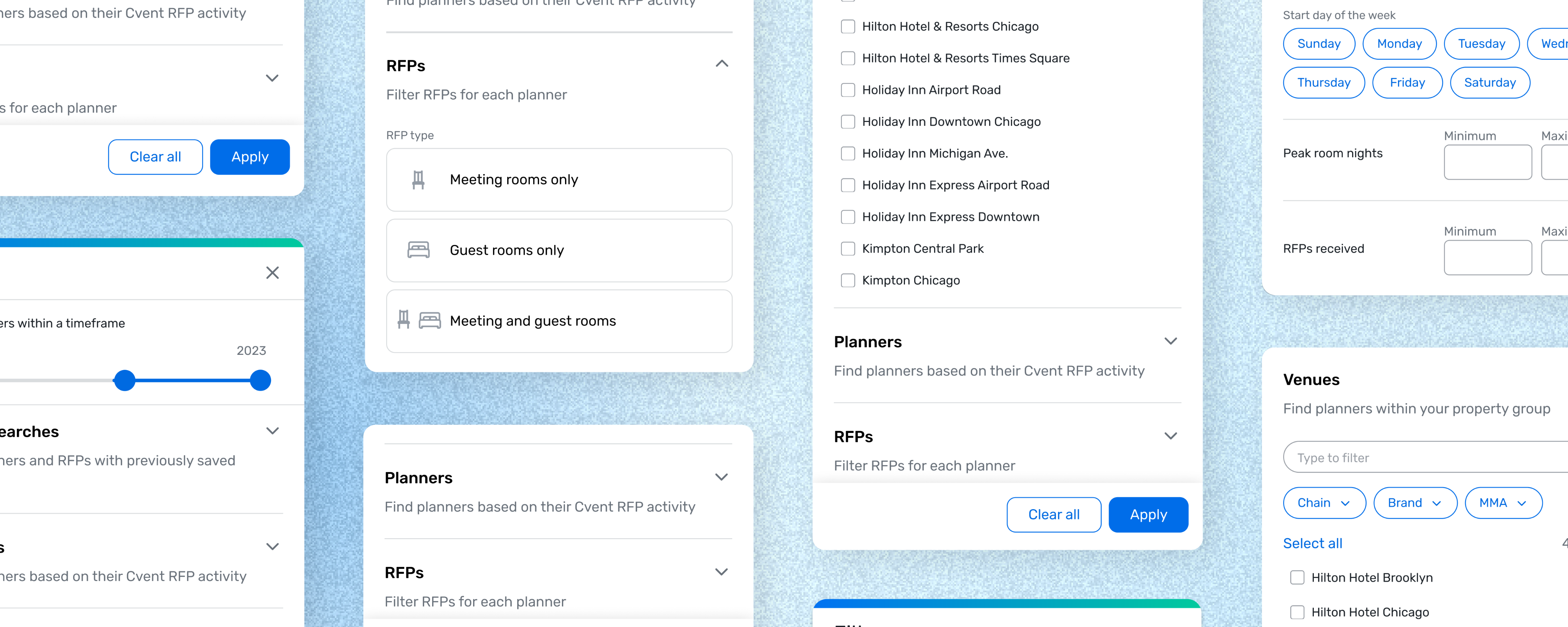
Panel and accordion system
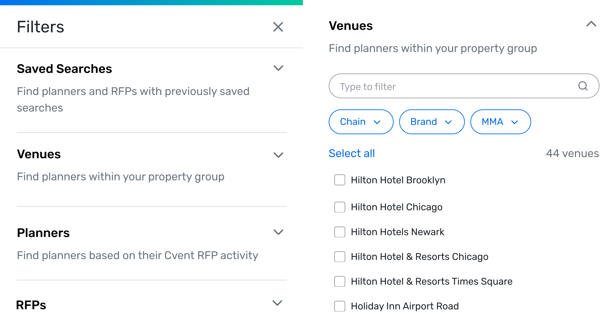
There were too many filters at the MVP, and the product was growing. I implemented an elevated panel and chunked related filters into accordions with clear help text. This allows the product to scale while keeping the core interface scannable.
Condensed tag treatment for applied filters
The original filter system caused tags to stack when filters were applied. I adopted a treatment where anything beyond the first row of filters collapsed into an expandable "+X more filters" chip.
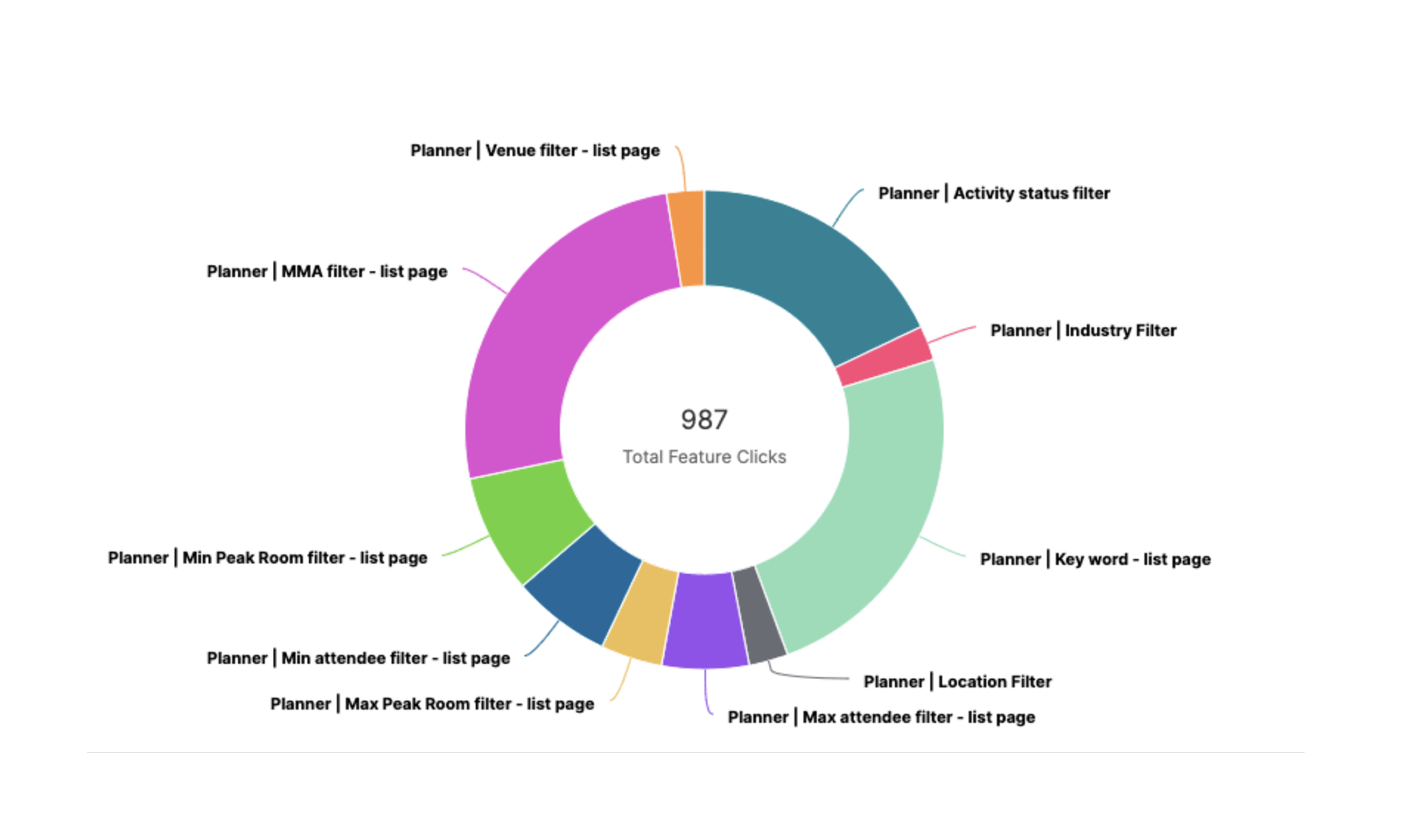
Zoom in: Operations efficiencies
Saving +$460K in efficiency by building a product library
Final designs
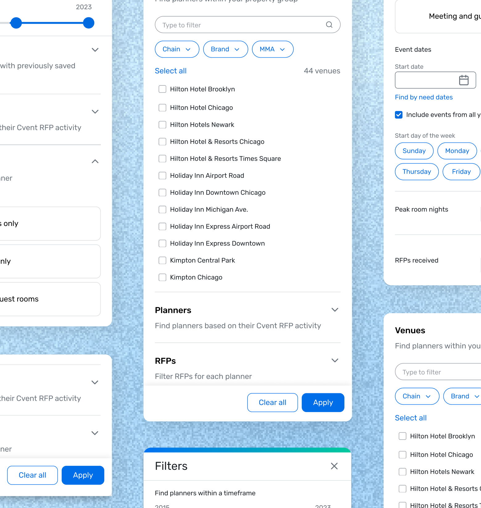
A single, scalable elevated panel
Labeled sections, help text, hierarchy informed by usage data, and a condensed tag system that doesn’t push what matters down.
Outcomes
+5M
Revenue impact YOY post launch
↑47%
Unique users YOY post launch
↑55%
YOY Increase in user engagement
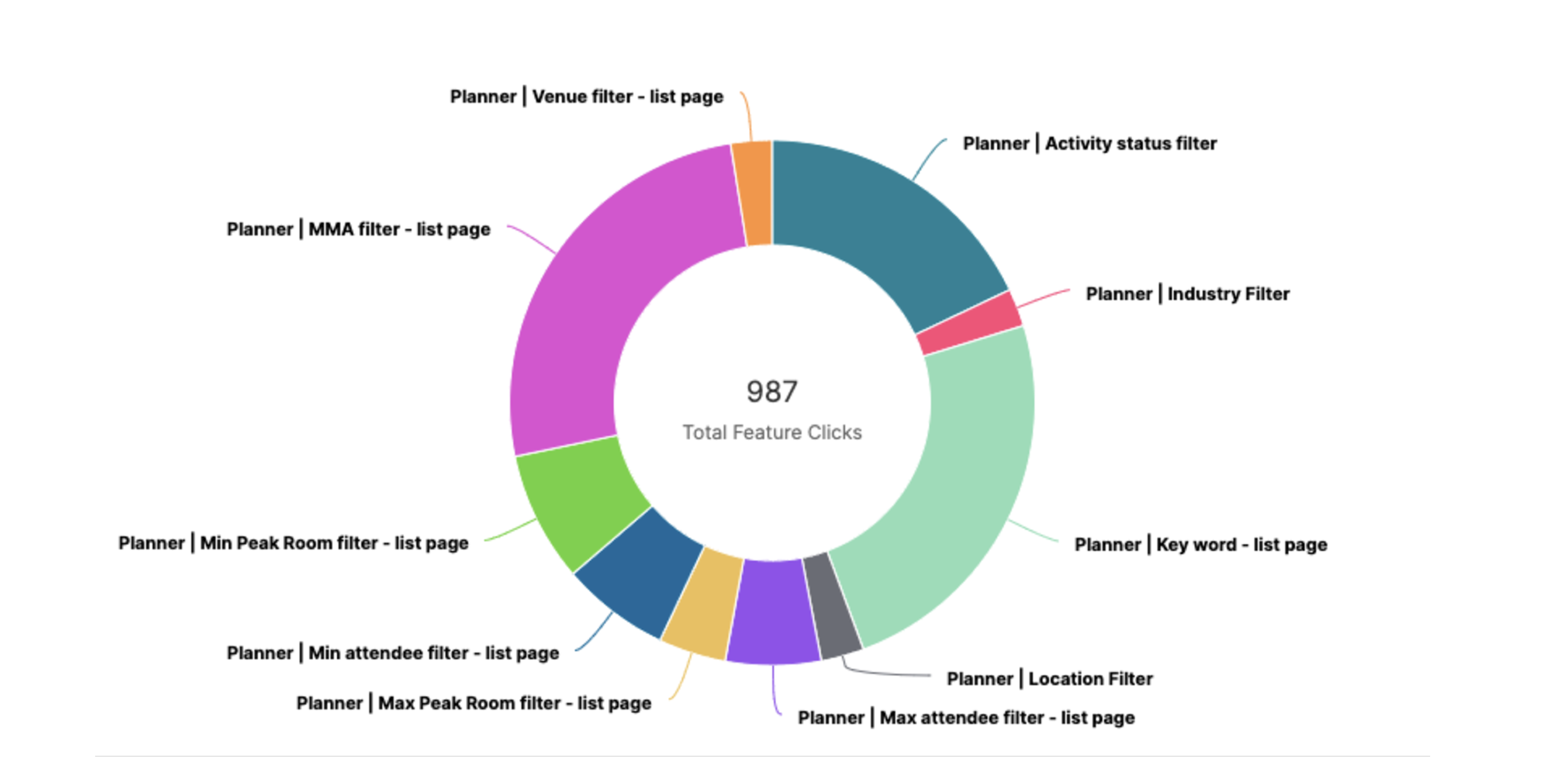
+8 filters have been added since initial release.
Lessons learned
Don't stress test out of scope
I spent significant time making sure the filter pattern worked across different search bar and navigation explorations which wasn't part of the ask. It's good to stress test edge cases, but I went too deep!
Look ahead on the roadmap
Part of a project shipped a month earlier included a way to hide the dual filter system. I didn’t know this redesign was coming, so we built and shipped something that was live for only a short time. Now I always ask PMs about upcoming and related projects at kick off.
Credits 🎬
My team lead was essential to project completion ( i.e. the one person that knew how filters worked), as were other UXers who brainstormed, shared learnings, and feedback. My manager also helped me understand I could complete this project while narrowing scope
Other work
AI Design
Beta testing
Product strategy
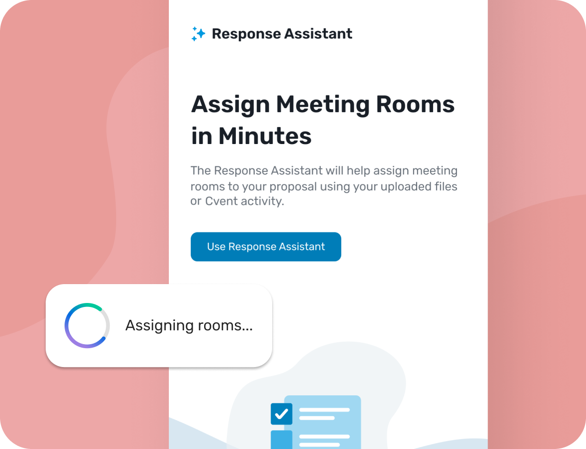
Saving hotels days of work with AI powered form filling
View →
B2C
Startup integration
Product strategy
Building bridges between product teams, and newly acquired users
View →
Filter Design
Design systems
Information architecture
Helping venues find the right event opportunities faster
Mending bonds between hotels and planners while scaling an intelligence powerhouse for better product market fit.
Role
Design lead, Researcher
Team
Product designer, Content designer, Engineers, Product management
Timeline
Mar - Apr 2022 (3 months)
Tasks
Information architecture, Interviews, Prototyping, Synthesis
Tools
Figma, Pendo
Hotels were struggling to find planners to connect with due to a perplexing dual filter system and clunky results. I created a scalable revamp with clearer content by conducting knowledge transfers, auditing other Cvent solutions, and testing internally. This redesign increased visible results by 400% and contributed to $5M in revenue.
+5M
YOY impact post launch
47%
↑ Unique users YOY post launch
55%
↑ YOY increase in user engagement
Context
Planner Navigator (PN) is a tool that hoteliers (salespeople at hotels) use to research and connect with planners. It has the best planner and event data in the industry but hoteliers weren’t sticking around. Tedious filtering and navigation made PN feel like a luxury address book no one had time to decode.
The Problem
How might we create a simplified yet scalable filtering system that users can know what they’re controlling and see more results per page?
*Without restructuring the current workflow
Generative Research
Building the right foundation before sketching was imperative. Only one SME in the organization truly understood how the filtering logic worked (we couldn’t blame users for being confused 😅), so I did a series of knowledge transfers.
01
Audit and knowledge transfers
Reverse engineer how filters actually work
Collaborator: UX
02
Review analytics
What’s used most, and does hierarchy support placement
Collaborators: Devs, PDs, CDs, UX management
03
Internal Interviews
What did other teams try, what failed, and why?
Collaborators: UX
Exploring Interaction Models
At this point in the project I envisioned search, filtering and navigation as inter-related elements that needed to be revamped at the same time (something I revisit in key decisions 😮💨). I ran workshops on search and nav to pull concepts into different panel explorations.
Key Decisions

Narrowing the scope
My initial designs incorporated how navigation and search needed to change in relation to the updated filter system. This ballooned scope and I eventually chose a simpler approach focused solely on filters.
Panel and accordion system
There were too many filters at the MVP, and the product was growing. I implemented an elevated panel and chunked related filters into accordions with clear help text. This allows the product to scale while keeping the core interface scannable.
Condensed tag treatment for applied filters
The original filter system caused tags to stack when filters were applied. I adopted a treatment where anything beyond the first row of filters collapsed into an expandable "+X more filters" chip.
Zoom in: Operations efficiencies
Saving +$460K in efficiency by building a product library
Final designs
A single, scalable elevated panel
Labeled sections, help text, hierarchy informed by usage data, and a condensed tag system that doesn’t push what matters down.
Outcomes
+5M
Revenue impact YOY post launch
↑47%
Unique users YOY post launch
↑55%
YOY Increase in user engagement
+8 filters have been added since initial release.
Lessons learned
Don't stress test out of scope
I spent significant time making sure the filter pattern worked across different search bar and navigation explorations which wasn't part of the ask. It's good to stress test edge cases, but I went too deep!
Look ahead on the roadmap
Part of a project shipped a month earlier included a way to hide the dual filter system. I didn’t know this redesign was coming, so we built and shipped something that was live for only a short time. Now I always ask PMs about upcoming and related projects at kick off.
Credits 🎬
My team lead was essential to project completion ( i.e. the one person that knew how filters worked), as were other UXers who brainstormed, shared learnings, and feedback. My manager also helped me understand I could complete this project while narrowing scope
Other work
AI Design
Beta testing
Product strategy
Saving hotels days of work with AI powered form filling
View →
NDA
B2C
Acquisition
Building bridges between product teams, and newly acquired users
View →
Filter Design
Design systems
Information architecture
Helping venues find the right event opportunities faster
Mending bonds between hotels and planners while scaling an intelligence powerhouse for better product market fit.
Role
Design lead
Researcher
Team
Product designers
Content designer
Engineers
Product management
Timeline
Mar - Apr 2022 (3 months)
Tasks
Information architecture
Interviews
Prototyping
Synthesis
Tools
Figma
Pendo
Hotels were struggling to find planners to connect with due to a perplexing dual filter system and clunky results. I created a scalable revamp with clearer content by conducting knowledge transfers, auditing other Cvent solutions, and testing internally. This redesign increased visible results by 400% and contributed to $5M in revenue.
+5M
YOY impact post launch
47%
↑ Unique users YOY post launch
55%
↑ YOY increase in user engagement
Context
Planner Navigator (PN) is a tool that hoteliers (salespeople at hotels) use to research and connect with planners. It has the best planner and event data in the industry but hoteliers weren’t sticking around. Tedious filtering and navigation made PN feel like a luxury address book no one had time to decode.
The Problem
How might we create a simplified yet scalable filtering system that users can know what they’re controlling and see more results per page?
Generative Research
Building the right foundation before sketching was imperative. Only one SME in the organization truly understood how the filtering logic worked (we couldn’t blame users for being confused 😅), so I did a series of knowledge transfers.
01
Audit and knowledge transfers
Reverse engineer how filters actually work
Collaborator: UX
02
Review analytics
What’s used most, and does hierarchy support placement
Collaborator: Product Analyst
03
Internal interviews
What did other teams try, what failed, and why?
Collaborators: UX
Exploring Interaction Models
At this point in the project I envisioned search, filtering and navigation as inter-related elements that needed to be revamped at the same time (something I revisit in key decisions 😮💨). I ran workshops on search and nav to pull concepts into different panel explorations.
Key Decisions
Narrowing the scope
My initial designs incorporated how navigation and search needed to change in relation to the updated filter system. This ballooned scope and I eventually chose a simpler approach focused solely on filters.
Panel and accordion system
There were too many filters at the MVP, and the product was growing. I implemented an elevated panel and chunked related filters into accordions with clear help text. This allows the product to scale while keeping the core interface scannable.
Condensed tag treatment for applied filters
The original filter system caused tags to stack when filters were applied. I adopted a treatment where anything beyond the first row of filters collapsed into an expandable "+X more filters" chip.
Zoom in: Operations efficiencies
Saving +$460K in efficiency by building a product library
Final designs
A single, scalable elevated panel
Labeled sections, help text, hierarchy informed by usage data, and a condensed tag system that doesn’t push what matters down.
Outcomes
+5M
Revenue impact YOY post launch
↑47%
Unique users YOY post launch
↑55%
YOY Increase in user engagement
+8 filters have been added since initial release.
Lessons learned
Don't stress test out of scope
I spent significant time making sure the filter pattern worked across different search bar and navigation explorations which wasn't part of the ask. It's good to stress test edge cases, but I went too deep!
Look ahead on the roadmap
Part of a project shipped a month earlier included a way to hide the dual filter system. I didn’t know this redesign was coming, so we built and shipped something that was live for only a short time. Now I always ask PMs about upcoming and related projects at kick off.
Credits 🎬
My team lead was essential to project completion ( i.e. the one person that knew how filters worked), as were other UXers who brainstormed, shared learnings, and feedback. My manager also helped me understand I could complete this project while narrowing scope
Other work
AI Design
Beta testing
Product strategy
Saving hotels days of work with AI powered form filling
View →
B2C
Startup integration
Product strategy
Building bridges between product teams, and newly acquired users
View →